
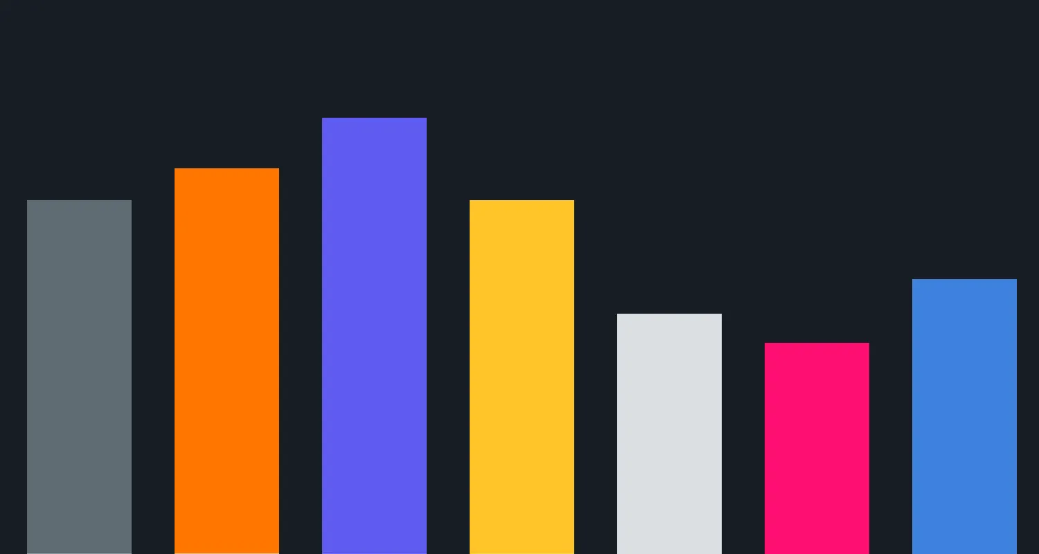
Understanding the Power of Data Visualization
In today's data-driven world, the ability to transform complex data into compelling visuals is essential for effective communication. Data visualization tools help businesses, marketers, and analysts convey insights clearly and persuasively. With numerous applications available, finding the right one can be daunting. Below, we explore 24 apps that generate reports and charts, making it easier for you to turn raw data into stunning visuals.
1. Microsoft Power BI
Power BI is a powerful business analytics tool that enables users to create interactive reports and dashboards. Its drag-and-drop interface makes it easy to visualize data from various sources, including Excel spreadsheets and cloud services.
2. Tableau
Tableau is a leading data visualization software that allows users to create a wide range of visualizations from their data. It supports real-time data analysis and is known for its user-friendly interface, making it popular among both beginners and experts.
3. Google Data Studio
This free tool from Google helps users turn data into customizable informative reports and dashboards. Google Data Studio integrates seamlessly with other Google services, making it an excellent choice for businesses using Google Analytics and Google Sheets.
4. Infogram
Infogram is an intuitive web-based application that allows users to create infographics and reports quickly. With a vast library of templates and design elements, Infogram is perfect for marketers looking to enhance their content visually.
5. Chart.js
For developers looking to add beautiful charts to their web applications, Chart.js is a simple yet flexible JavaScript library. It offers various chart types, including bar, line, and pie charts, and is easy to integrate into any project.
6. Canva
Canva is primarily known for its design capabilities, but it also offers features for creating charts and graphs. Users can choose from a variety of templates and customize them to suit their data visualization needs.
7. Piktochart
Piktochart specializes in creating infographics and presentations. Its user-friendly interface allows users to visualize data in engaging formats, making it a favorite among educators and marketers alike.
8. Venngage
Venngage is another online tool that focuses on infographics. It provides a variety of templates and design options, allowing users to turn complex data into easily digestible visuals.
9. D3.js
D3.js is a powerful JavaScript library for producing dynamic, interactive data visualizations in web browsers. Its flexibility allows developers to create complex visualizations tailored to specific needs.
10. Google Charts
Google Charts is a free tool that provides a variety of interactive charts. Its ability to pull data directly from the web makes it an excellent option for real-time data visualization.
11. Zoho Analytics
Zoho Analytics is a business intelligence tool that allows users to create insightful reports and dashboards. It offers features like data blending and AI-driven insights, making it suitable for organizations of all sizes.
12. QlikView
QlikView is a business intelligence tool that supports data visualization, dashboarding, and reporting. Its associative data model enables users to explore data intuitively, uncovering hidden insights.
13. Klipfolio
Klipfolio is a cloud-based dashboard tool that helps businesses visualize their data through real-time dashboards. It supports integration with various data sources, providing a comprehensive view of business performance.
14. RawGraphs
RawGraphs is an open-source data visualization framework that allows users to create a wide range of charts and graphs. Its user-friendly interface makes it easy to visualize data without extensive coding knowledge.
15. TIBCO Spotfire
TIBCO Spotfire is a robust analytics platform that provides data visualization and analysis capabilities. It enables users to create interactive dashboards and perform predictive analytics.
16. Looker
Looker is a data platform that offers powerful business intelligence and analytics features. Its visualization capabilities allow users to create interactive dashboards that can be shared across teams.
17. Sisense
Sisense is a business intelligence tool ideal for handling large datasets. It provides data visualization, analytics, and reporting features, allowing users to create interactive and insightful dashboards.
18. Datawrapper
Datawrapper is a user-friendly tool designed for journalists and other non-technical users. It allows users to create simple yet effective charts and maps quickly.
19. IBM Cognos Analytics
IBM Cognos Analytics is a comprehensive business intelligence tool that provides data visualization, reporting, and dashboarding capabilities. Its AI-driven insights help users make informed decisions.
20. ChartBlocks
ChartBlocks is an online tool that simplifies the process of creating charts. Users can design their charts and export them in various formats, making it an excellent choice for quick visualizations.
21. Excel
While primarily a spreadsheet program, Microsoft Excel offers a range of charting tools. Users can create various types of charts directly from their data, making it a versatile option for data visualization.
22. Visme
Visme offers a range of data visualization features, including charts, infographics, and presentations. Its easy-to-use platform is perfect for creating engaging visuals for various purposes.
23. Google Sheets
Google Sheets is more than just a spreadsheet tool; it also offers chart creation capabilities. Users can visualize their data using various chart types directly within their spreadsheets.
24. Lucidchart
Lucidchart is a diagramming application that allows users to create flowcharts, mind maps, and organizational charts. It’s particularly useful for visualizing processes and data relationships.
Conclusion
Choosing the right tool to turn data into visuals can significantly enhance your reporting, presentations, and overall communication strategy. With the above-mentioned 24 apps, you have a variety of options to explore. Whether you're a marketer looking to create engaging content or a business analyst seeking to present data insights effectively, there's a solution tailored to your needs. Embrace the power of data visualization to make your insights more impactful!